Lovelace Interiors
By Cara McBroom
I don’t know about everyone else, but I am starting to get that warm fuzzy feeling of excitement for fall! I am ready for cooler weather, boots, warm lattes and a cool new shade of lipstick that makes me feel all festive and girly (even though I don’t even wear that much lipstick)!
I am not one to browse all the style blogs and read all the magazines that tell me what colors I should be using, but this year there is one color scheme, in particular, that won’t stop speaking to me! It jumps out at me in the jewelry section at Target, and screams my name as I’m browsing art for a client. I’m talking about dried wild flowers and pumpkins! A purple and coral sunset: Lavendar, Coral, Salmon, Blush, and soft Orange.
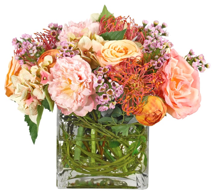
NDI peony arrangement: I can order this for anyone interested!
I, apparently, am feeling very romantic, flirty and sweet!
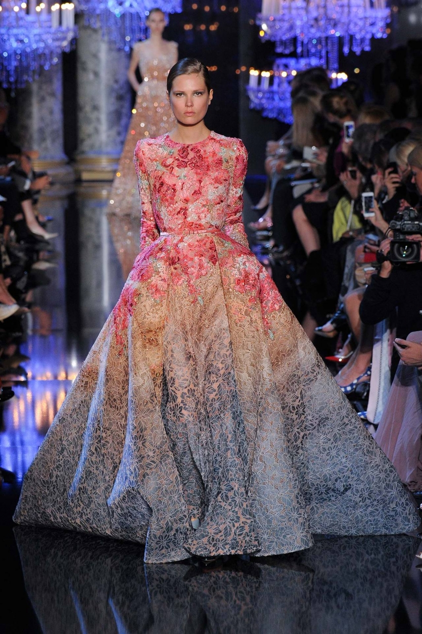
Have a look at this to-die-for Elie Saab couture gown!
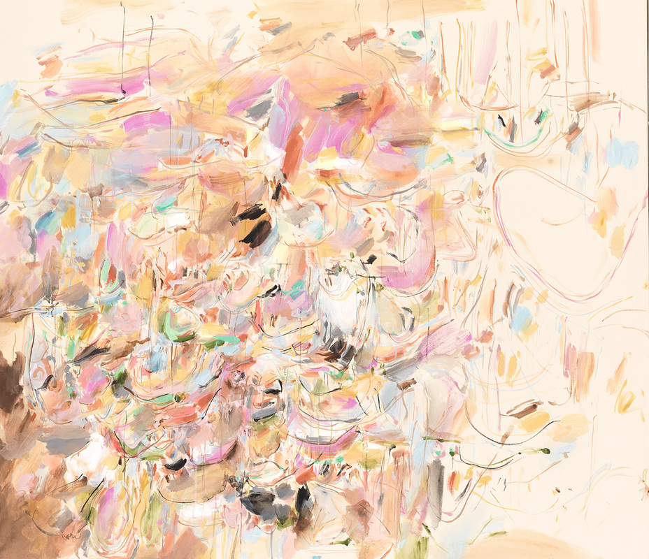
I ran across a line of giclees by a company called CHC Art, a company I use often in my design work. I couldn’t stop staring at the art– I absolutely adore this color combination!
From the soft & delicate collection of CHC Art’s line of giclees.
Look at the gorgeous items I found while browsing Emporium Home for a project! Ball Agate Chandelier, and Amethyst Tray.
I can always find something I like at Anthropologie. This outfit and these earrings are exactly what I’m talking about!
Actually, I found this necklace at Target. I took a photo of it for blogging purposes, and then had to drive back the next day to buy it! At $21.99, how could I not?? I wore it today! I can’t wait to mix color-blocked outfits and wear this in the fall.
In case you’re on your way to Target already, why not shop for some makeup? This fall palette is actually by Lancôme.
If you have a neutral color scheme, why not jazz up your décor with pillows out of this Romo Fabric (Mariola Blush), and add some soft art & accessory color accents!
I love this room. Just–ahhhh! I love it! Photo via Shelterness blog
Dress from the Erdem Fall 2015 collection
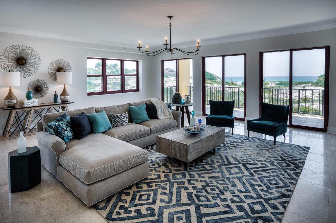
Beautiful room, via HGTV home.
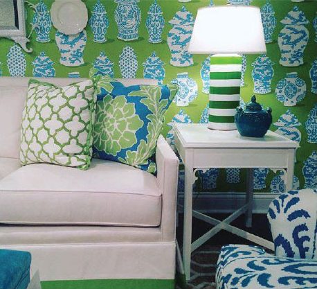
An adorable vignette, with a lavender console, and pale coral wallcovering. via designgab blog
I have a weakness for jewelry. This long necklace is by Marco Bicego.
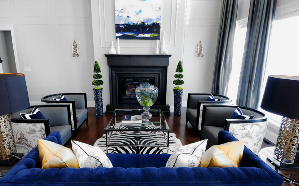
Pinterest delivers this modern room, with lavender sofa, and tasteful orange accents.
This variation is monochromatic, but has the same feel! via Laura U Interior Design
Why not throw in some pale aqua to offset all the warmth? This picture of Venice is a nice example.
I could live in this painting! Another great giclee from CHC Art.
And here’s what I imagine this painting would look like, if you turned it into a room:
photo via HGTV. I’m loving those super pale aqua walls!
The cool blue allows the lavender chairs, and salmon drapes to really shine. Photo via Apartmentsilike blog.
Now, what would happen if you kicked the color saturation up a notch? Do you love color as much as I do? Try these schemes:
Loving this 2015 color forecast from fashionvignette blog!
Gimme, gimme some jewelry! More anthropologie goodness.
Tiznit Drops earrings & Tajimi Collar
Another NDI waterlook arrangement, delivering more color!
Adorable. Susan E. Brown Interior Design
Let me order you this pillow from Romo! Please! It’s like art for your sofa.
This is a wonderful mix of modern and traditional. Girly, but not too soft! via Tumblr
This makeup palette by Chanel provides the perfect amount of “pop”!
This is an original piece of art sold by Emporium Home, and some cabinet knobs from Anthropologie.
Okay, ONE MORE giclee from CHC Art’s “soft & delicate” line.
…and one last drool over this table setting and centerpiece!
Who wants to go shopping with me?!? I’m ready!


