By Lindsay Miller
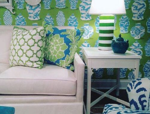
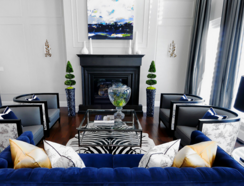
 Most every interior designer will tell you to keep your home basics neutral, classic, and non-trendy. But neutral doesn’t have to equal blah. Think back 10-15 years when beach front condos were painted traditional golds and reds, had heavy, ornate bedding, and there were monkeys and palm trees everywhere! Then coastal design went through a phase where the concept was “the brighter the better.” As you walked into a condo the first thing you saw were sailboats, coral and turquoise wall colors, and shells, shells, and more shells. Now design has taken a more neutral stance. By keeping your wall color, cabinetry, and major upholstery pieces in the neutral white/khaki/beige color family, this allows for pops of color change in smaller accessories, art, and bedding.
For example, the Pantone color of the year 2013 is Emerald Green. Just imagine if you based your color scheme around a yearly trend… from a monetary standpoint it’s much easier to change a pillow than a wall color! So, stick with neutrals, and throw a pop of color in to make that bold statement! If you think neutral is boring, see some of the serene images below that depict this classic design style.


