Lovelace Interiors always strives to use the Elements and Principles of Design throughout each project. We asked our summer interns to analyze a few projects and discuss how the elements and principles show in each space. We hope you are able to take away design advice about a thing or two!
Summer Intern Series Part 1:
Designer: Cara McBroom; Written by: Alison Cowart

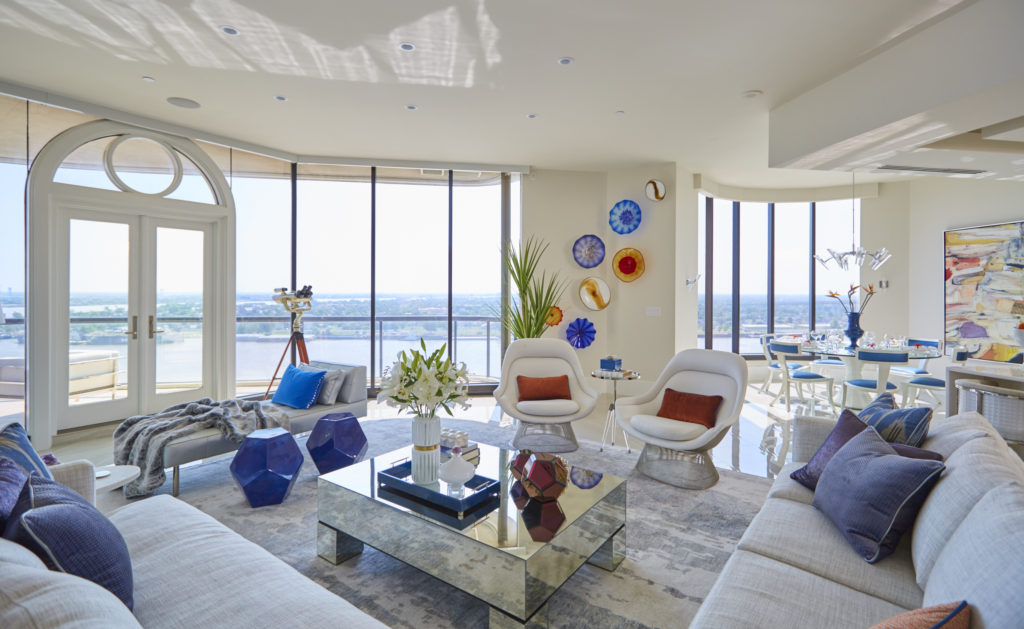
In a space as large and open as Crescent City Color, correct proportions can be difficult to achieve. The designer made careful selections in order to ensure that each piece of furniture had a sense of belonging. From the height of the chairs to the form of the throw pillows, each piece works together to create a unified space. The unity in this design creates smooth transitions throughout, and allows users’ eyes to happily dance from one area to the next.

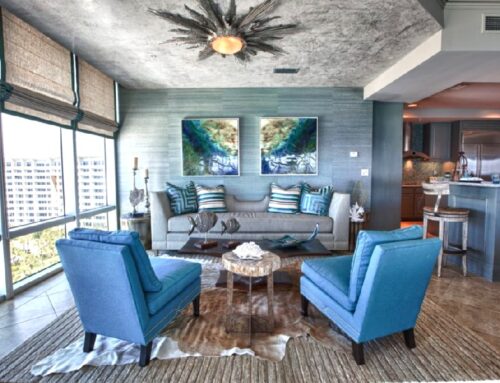
Lines act as visual guides throughout this area. A dropped ceiling emphasizing horizontal line is used to define the kitchen and create a sense of comfort in the space. The lighting design in the kitchen is designed to create vertical eye movement in an otherwise horizontal dominated space. This is achieved by placing lines parallel to the island in the ceiling, which emphasizes the kitchen island and creates a focal point for the room.

Pattern and texture are used to help create rhythm in this lively bedroom. Pulling colors from the artwork and dispersing them around the room creates a balanced look. The repetition of geometric mirrors and bold blue ottomans are used to maintain a visual tempo between the heavily weighted artwork and the rest of the room. Even the solids in this room are brought to life, such as the velvety shine from the rug and the geometric print of the duvet.

Contrast is created throughout this space with vibrant pops of color against a subtle background, making the unique furniture and artwork very distinguishable. The abundance of natural light throughout this space highlights the colors and textures perfectly.

The symmetry displayed in this sitting area creates a balanced look. Although the wall decor is asymmetrical, the proportions of each side balance one another to create a pleasing visual weight.


