Summer Intern Series Part 2:
Designers: Lindsay Miller & Karen Kerns; Written by: Madison Vincent

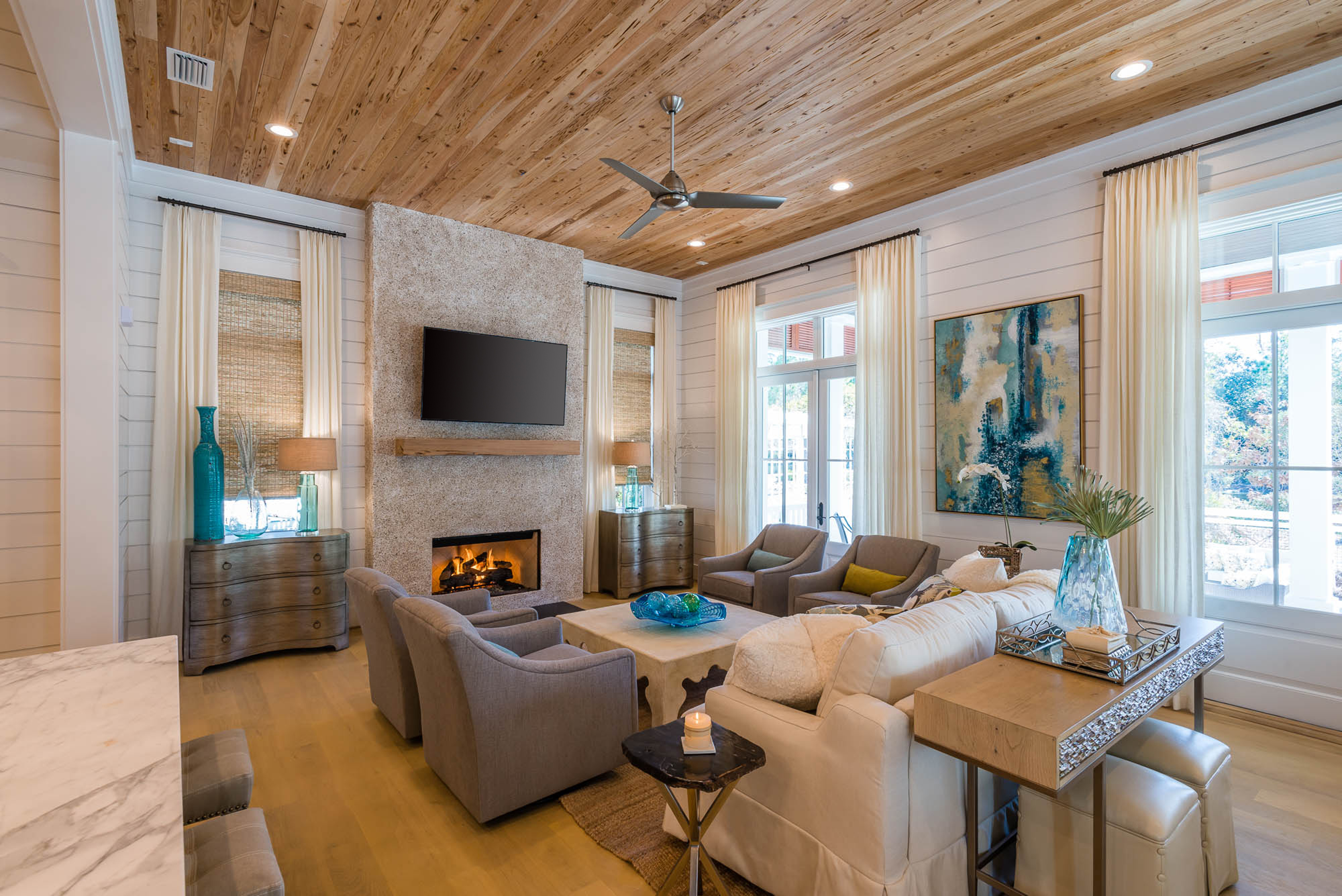
When looking at this gorgeous living room, you can see symmetry. Symmetry shows that you can cut the image in half, and it will be the same on both sides. If that isn’t the case, then it would be called asymmetrical. There’s balance between the chairs on each side of the coffee table. There is also symmetry between the lamp, chests, and draperies. Creating a room that is symmetrical is very common in design and is easy on the eyes.

Neutrals colors are important and set the mood for the space. Using wood planks along the ceiling creates warmth in the kitchen and provides contrast to the cool white cabinet and marble countertops. The hint of mint in the backsplash creates a focal point and gives the space additional color.

Balance refers to the relationship of different hues to one another when each is perceived to be equal in perceived visual weight. This space shows symmetry and color balance. Color balance is creating harmony within the space, and contrast to emphasize differences between different objects. The balance between the artwork on the wall and the side chairs, create a visual balance throughout the space.

Repetition is the systematic orderly succession of identical design elements (shape, line, color, form) along a define path in space. Repeating certain elements creates unity within the space. Horizontal lines are repeated throughout the shiplap wall, the wood ceiling and flooring, while repetition is also happening with the furniture and dining table placemats.

Proportion is defined as the size relationship between elements and the visual composition. It is more important than what most people realize. If pieces don’t follow the proper scale, it throws the weight of the room off. If you use furniture that is too large for a space, it can make the room appear smaller. Karen and Lindsay executed proportions well in this space. The furniture items are in relationship with each other, as well as the space.


